Enjoy this Guest Post from frequent Overthinking It contributor Sean Nixon! Overthinking It Editors Ryan Sheely and Matt Belinkie helped out with editing, graphics production, and hot takes on Eurovision.—Ed.
As much as my wife enjoys the performance portion of the Eurovision Song Contest (ESC), she’s mostly there to watch as the points are awarded. For her, the real contest is trying to predict which countries will vote for each other. Collusion between the former Soviet Bloc, solidarity among the Nordic delegation, snubs among old enemies, the surprise 12 points awarded to an otherwise panned song, the jury ballot from each country is a fresh opportunity to comment on geopolitics and cultural ties.
By contrast, I’m a huge stick in the mud who chalks up any of her apparent success to confirmation bias. It’s quite possible that a certain amount of randomness in the voting results has produced the illusion of voting cabals. Eerily prescient guesses may just be blind luck. Is my wife in tune to the unspoken treaties of Eurovision, or is she spinning a narrative around random difference in similar ballots? I can’t hold a candle to her political intuition. I can, however, turn this into a math question and then analyze that sucker to the full extent of the law.
As it turns out, I’m not the first to have this inclination. Finding bias in the Eurovision voting results has been a popular pastime for European academics for decades. Gad Yair’s 1995 paper, “Unite Unite Europe”, analyzed the voting data from 1975-1992 and broke the 24 (22 after removing Cyprus and Iceland who never competed concurrently) participating countries from that time period into three voting “cliques”: the Western Bloc, the Northern Bloc, and the Mediterranean Bloc. However, since then the number of contestants has nearly doubled, and computing power has more than doubled. Fenn, et al (2005) compared the clustering of countries in actual Eurovision results (from 1992-2003) against the expected amount of clustering found in randomized results, concluding that the ESC voting patterns were more than just random. Gatherer (2006) came to similar conclusions using Monte Carlo simulations (a probability analysis technique), and went further to show that the level of “collusive” voting has been progressively increasing. For a more purely statistical approach, Ginsburgh and Nuory (2008) showed any voting reciprocity at Eurovision could be explained by linguistic and cultural distances as opposed to political vote trading. Similarly, Clerides and Stengos (2012) applied econometrics to connect ESC voting with factors like language, proximity, exports, etc. Their study also included variables like the sex of the performer or the ordering of appearance (a surprisingly important factor). Blangiardo and Baio (2014) took a Bayesian approach which escaped the academic halls to garner some press a couple years ago. This is far from an exhaustive list.
This article takes a slightly different approach with the goal of digging out the connections from the overall voting results and then analyzing the emergent networks. The analysis combines methods of controlling for quality (present in Ginsburgh or Clerides) with a network approach (similar to Gad and Fenn). Previous work on network structures in Eurovision relied on multi-year averages to account for song quality, which is not necessarily a safe assumption. I’ve considered the voting data on a year by year basis (though multi-year extensions are possible for future study). This sacrifices some of the ability to make big sweeping pronouncements in exchange for more easily depicted and interpreted results. Attempting to identify the individual connections for a single year seems to be a novel approach. In another deviation from previous studies, I’m applying a brute force approach to finding clusters as opposed to the more common hierarchical methods. Finding the ideal set of clusters in a graph is computationally infeasible for large graphs, i.e., optimization is an NP-complete problem. However, the small number of countries involved allows for an exhaustive search to be implemented.
Methodology
Here’s the basics: Each year up to 46 countries from the European Broadcasting Union (EBU) send representative bands, divas, baking grandmas, yodelers, etc, to compete in the ESC. Since 2004, two Semi-Finals have been held in the days leading up to the Grand Final in order to narrow the field to a top 26: ten countries from each of the two semi’s plus the host country and the Big Five (France, Germany, Italy, Spain, and the United Kingdom). The winner is determined in a round of voting among the participating nations about an hour after all the songs have been performed. The exact method for how countries decide their vote has varied over the years from expert juries to televoting to strange amalgamations of both. One by one, each county casts a ballot (announced by a local celebrity) awarding 1–8, 10 and 12 points to their favorite acts. Except in 2016, when each country cast two separate ballots and only one was announced live on air, because obtuse scoring rules are a Eurovision tradition.
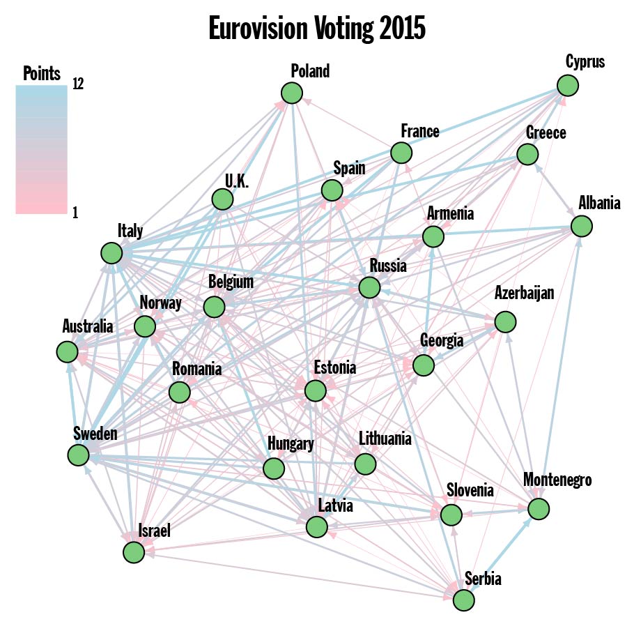
Figure 1. Note: Both Austria and Germany received zero points and have been omitted from the Graph of finalists.
The Eurovision website currently offers a full run down of the voting results from 2014-2016. Results dating back to 1975 (when the 12, 10, 8-1 point system was adopted) are fairly simple to ferret out, but I’ve opted to stick to the officially available data. Every country can be thought of as a vertex (green dot) in the giant Network of the European Broadcasting Union (plus Australia). Each country awards a total of 58 points to ten other countries. Those points are represented as edges connecting the countries. An example from 2015 (with just the finalists) can be seen in Figure 1. This is a weighted directed graph: weighted because the number of points is different among the edges, and directed because the are point are being awarded in a particular direction. Finding the clusters, also called the communities/community structure, in the Voting Graph is now a well defined problem. Well, technically, there’s quite a few competing definitions, but they’re all something that we calculate. Except when we can’t…
Modularity
Let’s take a step back. Only about 40 countries compete in the contest each year, so there’s no worries that the communities will be undetectable. And, I’ve chosen to group the countries in a way that maximizes the Modularity. In layman’s terms, modularity measures how well the connections in a network (graph) manage to stay within the communities. The more edges that connect two countries in the same community the better. A formal definition might look like:
![]()
This means that you need to beat expectations to have a positive modularity. For example, putting all the countries into one community yields a modularity of zero, since you already expect expect all the edges to stay within that one mega-community. A negative modularity means that you’ve done a terrible job of picking the communities.
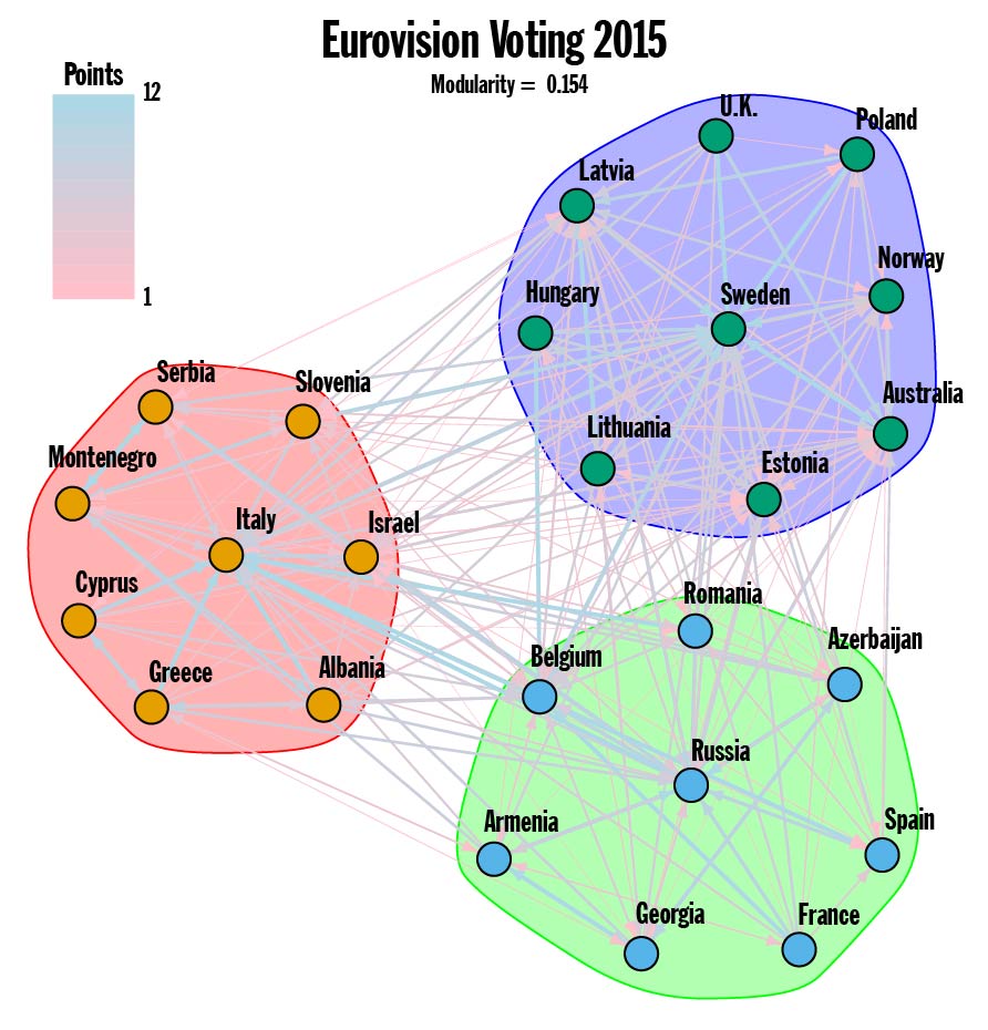
Figure 2.
Now we can take another look at the 2015 Voting Graph. Running a brute force optimization on the full Voting Graph produces a modularity of 0.154, which is small but not insignificant for a graph with 250 edges connecting 25 vertices. If you scrutinize Figure 1 carefully, you discover that just about everyone awarded 10 or 12 points to Sweden, Russia and Italy, and this fact is reflected in the communities found (see Figure 2). The top three ranked counties from 2015 have cliques of countries within their sphere of influence. This is an especially pronounced display of the influence highly ranked countries have on the overall community structure.
Connections
Still with me? Great! For any given year, the frontrunners wield an unwarranted and unwanted level of importance in deciding the community structure. The real trouble is accounting for song quality. If there really are international connections influencing the voting habits of Eurovision, how can they be separated from influence of Bond-esque power ballads (2014 winner) or expertly choreographed and animated light shows (2015 winner)? To find the underlying connections, we look for pairs of countries that gave each other an above average number of points.
Creating the Connections Graph from the Voting Graph is a two step process. First, an adjusted set of votes is found by looking for instances where the number of points awarded is above average. In other words, the song quality is measured in terms of average points received. Second, I take the geometric average (square root of the product) of the extra points two countries gave each other. Primarily this eliminates any of the unrequited connections where the extra points weren’t reciprocated. The resulting Connections Graph is still weighted, since strength of the connection can vary from edge to edge, but no longer directed, since the connections must run both ways. The weight (indicated by both color and line thickness) represents how many extra points the connection is worth.
A more detailed description of this process can be found here.
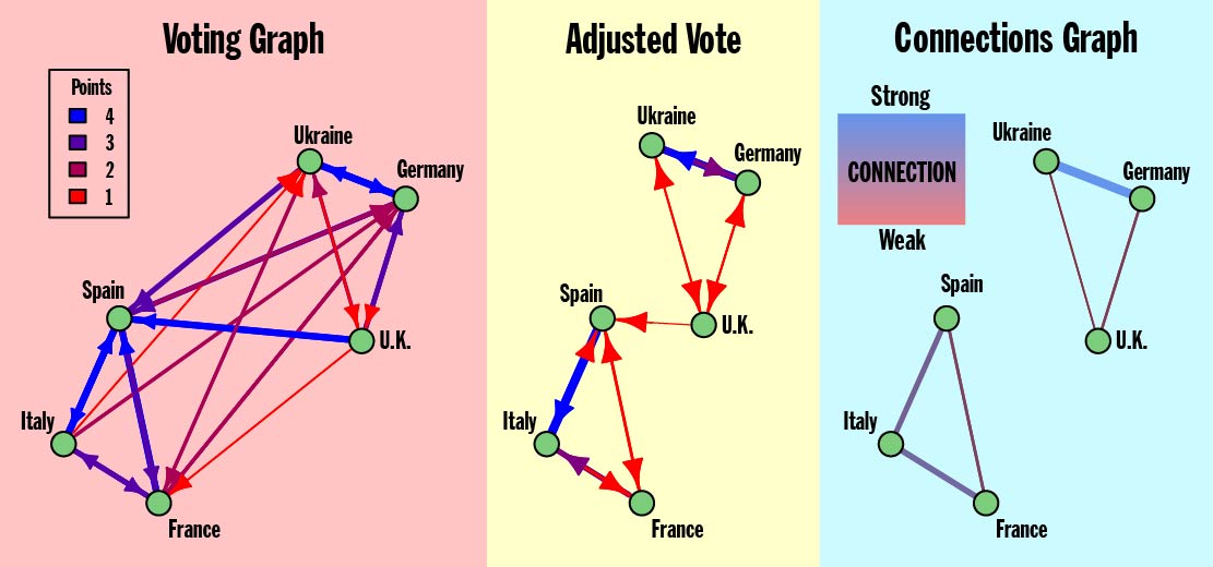
Figure 3. Model Eurovision showing the creation of the Connection Graph from the Voting Graph
Once the Connections Graph for a set of Eurovision results has been found, there’s still a question of how to best interpret that graph. What should we expect from the Connections Graph? Particularly, what should the Connections Graph look like if my wife’s theory is correct? In the extreme case where there is no bias whatsoever, the Connections Graph would have zero edges. Irrefutable evidence for my wife’s theory would be a graph where the countries split up into clear groups all sharing edges. The Model Eurovision in Figure 3 has two such groups consisting of Ukraine—Germany—U.K. and Spain—Italy—France.
2015- Cool Kids, Losers, and Montenegro in the Middle
After adjusting for song quality and looking for connections that run both ways, the Voting Graph from the 2015 ESC reduces to the far more manageable Connections Graph depicted below. The number of vertices remains 25, however the edges have been culled back a meager 39. Less edges means that the modularity will naturally go up, so it’s important to note that 0.55 is well outside the range of values expected for a graph of this size.
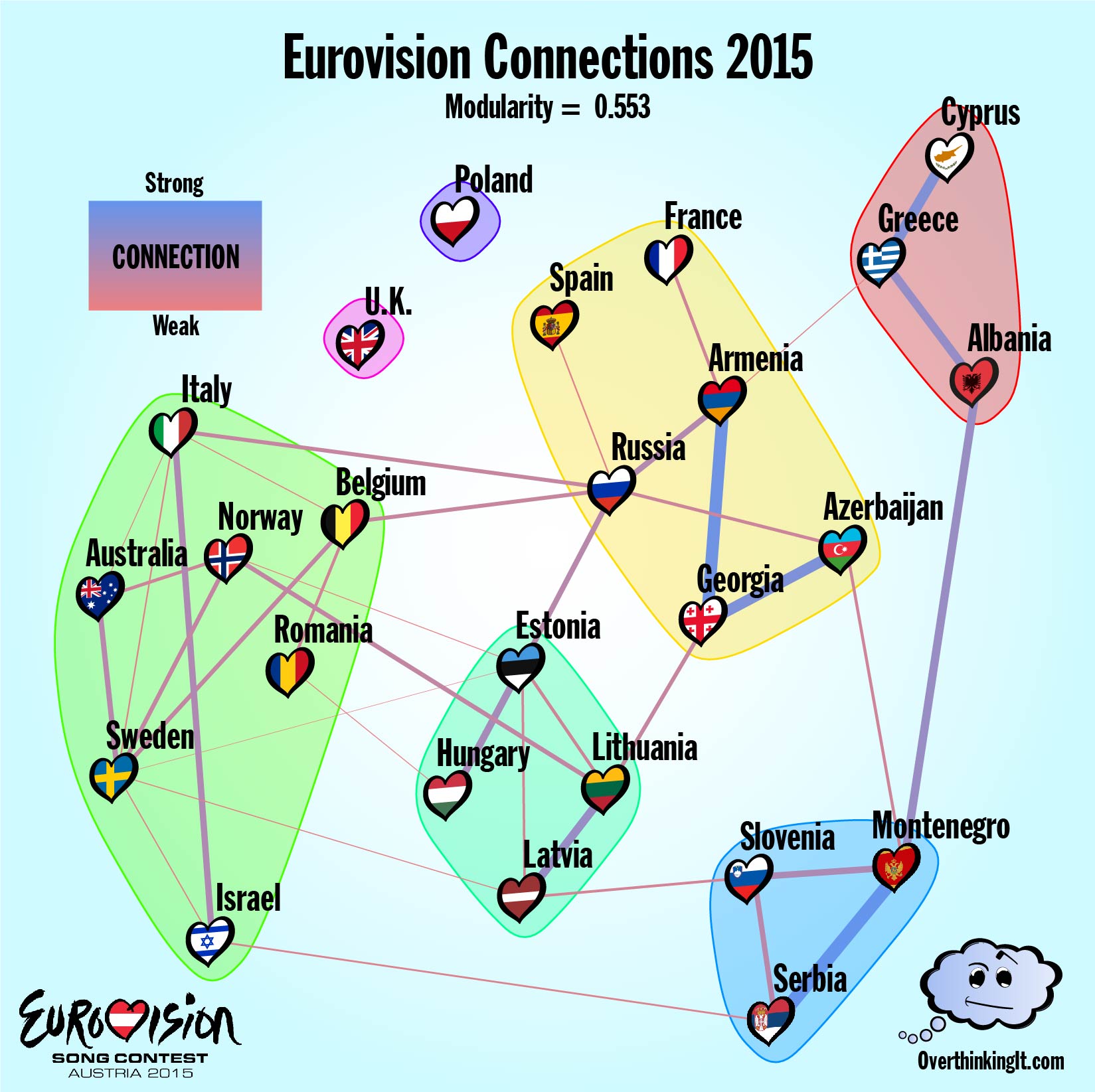
Figure 4.
It remains true that the contest frontrunners have a disproportionate importance when finding communities. Connections are found by looking at the variations in voting, so they are more easily detected when countries are actually receiving points. The inverse is also true. Spain, France and the U.K. all had weak showings in 2015. By skipping the vetting of the Semi-Finals, the Big Five manage to get quite a few big duds to the main event and then that happens any connections these countries might have can’t be easily detected. In other words, if your song is so meh that almost nobody votes for it, it’s hard to see if you have any alliances. I think of this as the “Nobody Likes a Loser” effect. The U.K. has a community all to itself and the inclusion of Spain and France in the Caucasus voting bloc is tenuous and based on single weak connections. The singleton (or near near singleton) communities in the graph mostly have to do with song quality.
Among the middle of the pack, the results are more revealing. The Baltic States, Serbia-Montenegro, and the Greek peninsula have all escaped the influence of the highly ranked contestants. The last two voting blocs break up into the Caucasus states along with Russia and a group of Western countries plus Romania. (Ignoring Spain and France as suggested above). This last block is interesting in that it does not rely on proximity, hinting at a globalist approach to cultural ties. The graph also seems to confirm the U.K.’s perennial suspicion that they don’t have any friends when it comes to Eurovision. Sadly for me, all sign point towards my wife’s theory of vote sharing being true. But what happens when we take a look at the results for 2014 and 2016?
2014 – Fairweather Politics or Eurovision Friends for Life?
In a world where the only factor affecting a country’s Eurovision ballot is song quality and a set of underlying cultural ties, the proposed model does a good job of avoiding false positives. But, it does tend to miss weak connections, or connections to weak contestants. The Connections Graph that results from the 2014 data appears in Figure 5 with a modularity of 0.539, similar to 2015.
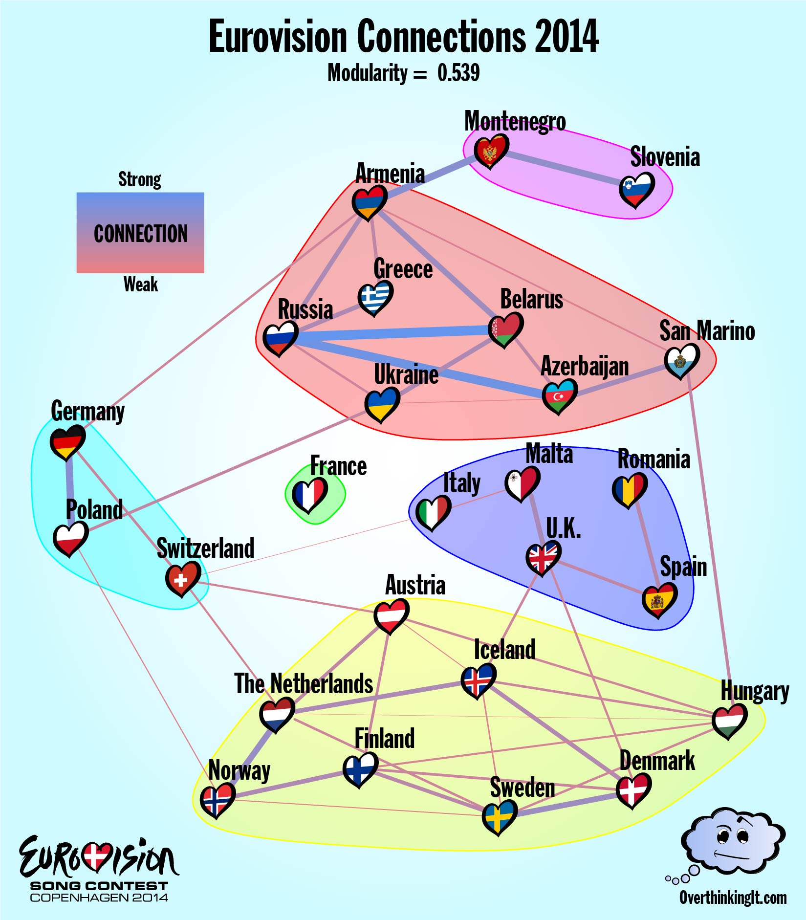
Figure 5.
The general structure matches what was found for 2015: a few small offshoot communities, and two more highly connected communities featuring most of the top songs (Austria, Netherlands, Sweden, etc…) that divided Eurovision into east and west. The “Nobody Likes a Loser” effect is a bit less pronounced. France’s song “Moustache” (which was ranked 26th overall) has been left out in the cold, but Azerbaijan managed quite a few connections even at rank 22. I have no idea what’s going on with San Marino, which is a country inside Italy smaller than most major cities, but appears to have a lot of support from Azerbaijan and Hungary for some reason.
For a direct comparison, there are fifteen countries that made it to the finals both years. (Fewer if you want to toss out the Big Five, who might not have made it there on merit.) Between those countries, five connections show up in both graphs:
Armenia<—>Greece
Armenia<—>Russia
Azerbaijan<—>Russia
Montenegro<—>Slovenia
Norway<—>Sweden
That’s out of 17 possible connections that appear at least once, or less than a third. To my mind, this suggests a certain amount of fluidity in Eurovision diplomacy. The communities are ephemeral and unpredictable from year to year. Let’s call this up a strike against my wife’s theory and move on to 2016.
2016 – National Schizophrenia
The 2016 Eurovision competition held in Stockholm came with a built in political narrative. After Russia’s annexation of the Crimean Peninsula left the Ukraine unable attend the 2015 contest, the Ukraine’s 2016 entry, 1944, presented a thinly veiled denouncement of the ongoing occupation. (Just enough to get past Eurovision’s prohibition on overtly political lyrics.) The Ukraine’s conspicuous departure from the usual Soviet voting bloc, had ripple effects. Armenia managed to keep a connection with both Russia and the Ukraine and this split loyalty almost certainly caused Armenia to end up in a separate community from Russia even though their connection is one of only 2 that appears in every year considered thus far.
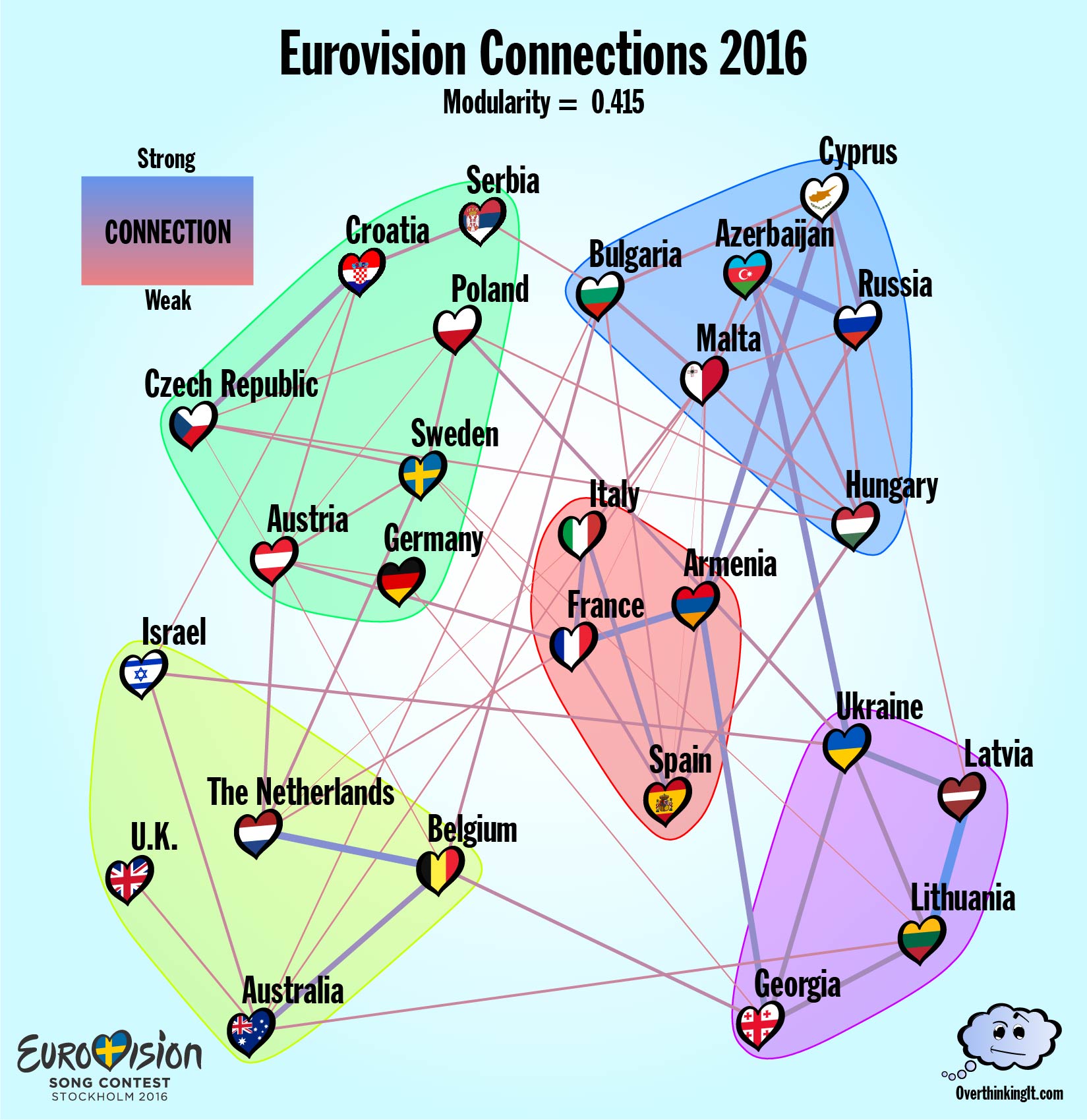
Figure 6.
ESC Stockholm also saw the rollout of the most substantial changes to the way countries award points since 1975. Unlike previous years, the rankings from the expert Jury and the rankings from the Televotes were tabulated as two separate ballots. Each Country awarded a total of 116 points (up from the usual 58) across a maximum of 20 other countries. In the Connections Graph for 2016, this resulted in a proliferation of edges. There are 62 edges in the Connections Graph, about 50% more than usual. And, many of these new edge run in between the communities, driving the modularity for 2016 down to 0.415.
All of this is symptomatic of nations who are divided within themselves. Looking at the Jury Vote and Televote separately shows a great deal of disagreement as to where the true connections lie. A grand total 74 connections arose in either the Jury Vote or the Televote, but of those, only 13 appeared in both sets of ballots. That’s a larger discrepancy than we saw between the Connection Graphs from 2014 to 2015.
Conclusions
At this point, it’s still unclear who was right, me or my wife. In favor of my wife’s cultural vote-sharing theory of Eurovision, the modularity values calculated for the Connection Graphs give strong evidence that the community structures found each year are more than just random chance. In favor of my theory of Eurovision, the inconsistency of the connections from year to year (and even within the same year in 2016) makes any predictions hard to put any confidence behind. The only truly persistent connections were with Russia, whose entry for 2017 has been banned from entering the Ukraine. You can bet that the first thing I’ll do after Saturday’s final in Kiev is track down the voting data to see what this year’s graph looks like.
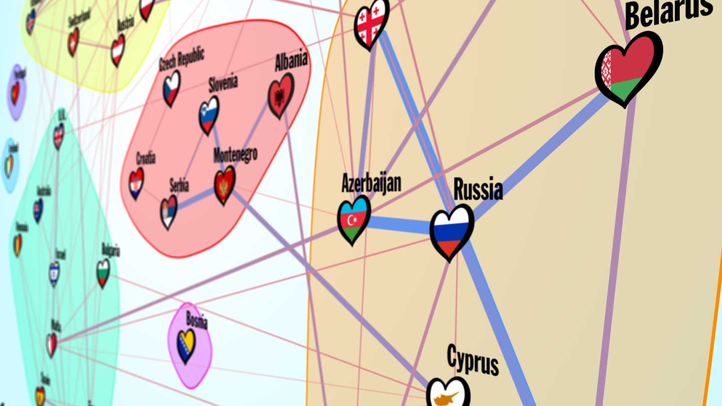
To wrap things up, let’s try one more round of analysis. One of the key issues has been the rotating set of contestants in the Finals from year to year. All the voting data from countries who were eliminated in the Semi-Finals gets lost when looking for two way connections between countries. Combining the data from 2014, 2015, and 2016 allows for a Connections Graph to be constructed for the whole of Europe (plus Australia and Israel).
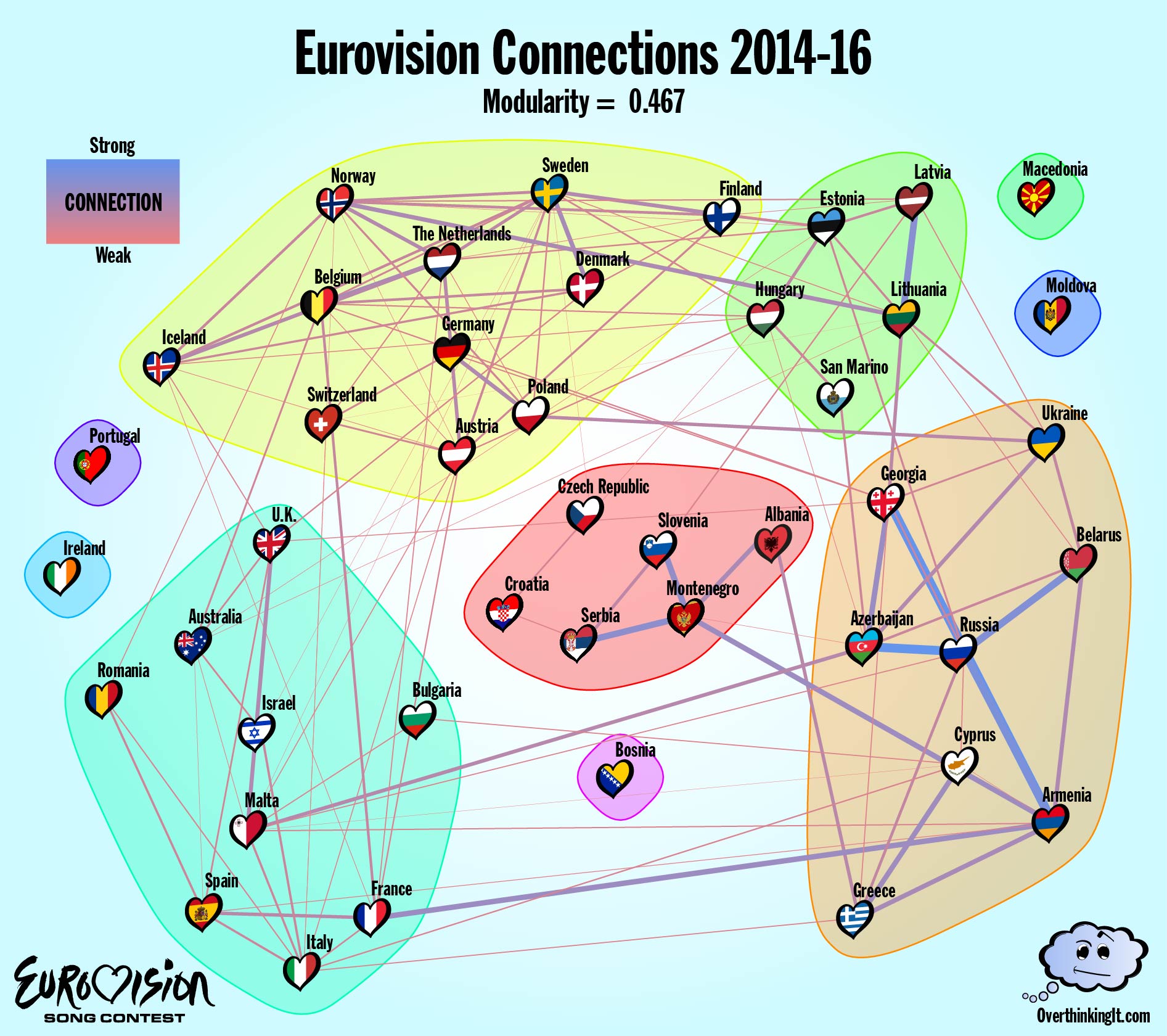
Figure 7.
So who was right? Me or my wife? Or neither of us? Chime in, and share your own interpretations in the comments!
Sean Nixon is a mathematician at SUNY Geneseo specializing in nonlinear waves and optics.
Interested in reading more about the methodology that Sean used, along with an example using a hypothetical model? Click on through for the Methods Appendix (yeah, this blog post has a Methods Appendix).
If you want to sleep more comfortably at night, you’re wife is correct…..(grin)
[img]http://i.imgur.com/yIJJfuN.png[/img]
Connections Graph for 2017.
http://imgur.com/yIJJfuN
Connections Graph for 2014-2017
http://i.imgur.com/CbwbVzm.png
I don’t think any of the countries moved group. Portugal and Moldova are no longer islands.