So You Want More Methodology? Here’s More Methodology!
While Eurovision generally relies on the democratic process, the six countries footing the majority of the bill get a by in the semi-finals. The host country, Ukraine in 2017, as well as the five largest contributors to the European Broadcasting union, France, Germany, Italy, Spain, and the United Kingdom, automatically advance to the main event. With this in mind, I’ve designed a six contestant model Eurovision to outline and illustrate the analysis being applied to the actual past voting data.
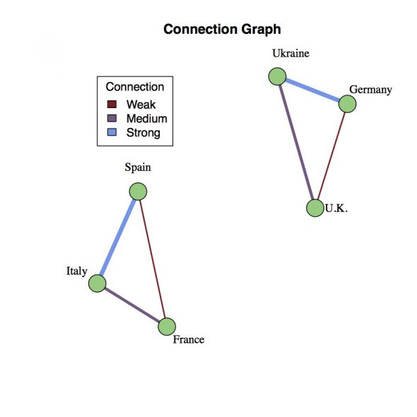
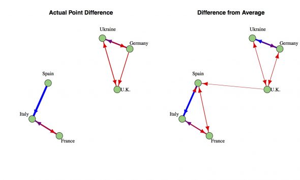
To begin with, let’s assume there’s an underlying set of connections between the countries. Depicted as a graph, each country is represented by a vertex (green dot) and cultural/political/geographic ties are represented by an edge (line) connecting the two countries. In the example to the right, connections have been chosen somewhat arbitrarily to create two easily identified communities of three countries: Ukraine-Germany-U.K. and Spain-Italy-France. Each edge also has a color coded weighting that represents the strength of the connection between the countries. Thus, the connection between Italy and Spain can be stronger than a more tenuous connection between the U.K. and Germany. The goal is to reconstruct this connectivity graph from the countries’ voting record during the song contest.
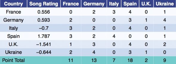
To simulate a contest, the song for each country is randomly assigned a rating. In the example below, the ratings were generated from a normal distribution with mean zero and standard deviation one. However, points are not awarded solely on merit. Each country has their own modified set of song ratings found by adding the weight of their connection (from the Connection Graph above) to the actual song ratings. Points are then awarded based on these modified ratings. For example, Spain has a much higher rated song than the Ukraine, however Germany still awarded the Ukraine the most points due to the strong connection between those countries. In the example simulation, all of the preferential treatment ended up washing out and the final point total line up with the song ratings. This is not always the case.
The voting results now form a new Voting Graph such as the one depicted in Figure 1 in the main article. Germany awarded the Ukraine 4 points, thus, a blue arrow points from Germany to Ukraine. Spain awarded the U.K. zero points, so while there may be an edge connecting Spain and the U.K., it only points from the U.K. to Spain without reciprocation. Hence, this is a directed graph as opposed to the Connection Graph which is only weighted.
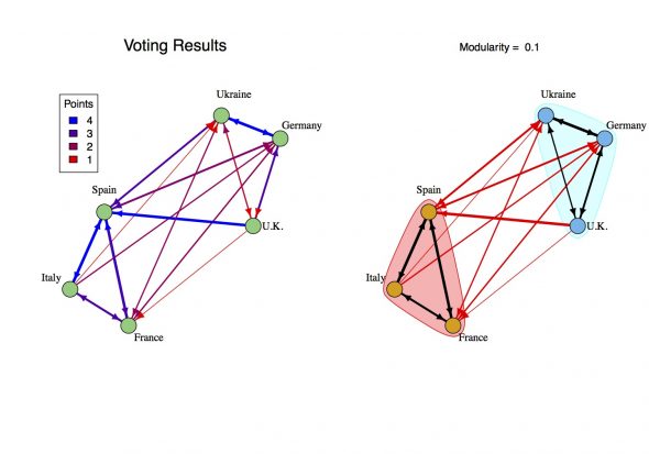
From the voting results, we aim to identify any instances where the underlying connection changed a country’s vote. For the example simulation, the actual ratings for the songs are given and so we can measure the difference between the expected ballot and actual ballot. However, when it comes to the real Eurovision Song Contest the songs ratings are unknown. This is the central issue outlined in the introduction. The most straightforward approach is to take the difference between the points awarded and the average number of points awarded. I call this the Adjusted Vote. This isn’t perfect, even if every country voted exactly based on the ratings there would be quite a few instances where a country awarded an above average number of points. As you can see, this procedure has produced several spurious connections between Spain and France (who are connected, but didn’t let that change their vote) as well as Spain and the U.K..
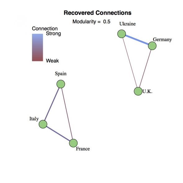
The final step is moving from the directed graph defined by the Adjusted Vote back to an undirected Connections Graph. For this, I’ve opted to take the geometric average, i.e., you multiply the connection going each way and then take the square root. Primarily this eliminates any of the unrequited connections between countries, so only connections that run in both directions survive. As a side benefit, this pushes the connection strengths towards 1 and hedges against outliers dominating the clustering calculations. In the example, the entire original Connection Graph has been reproduced with slightly under estimated weights. Upon repeated trials with different sets of ratings, this method generally reconstructs the strong (weight = 3) or medium (weight = 2) connections, catches the weak (weight = 1) connections about half the time, and rarely gives a false positive.
Sean Nixon is a mathematician at SUNY Geneseo specializing in nonlinear waves and optics.
If you want to sleep more comfortably at night, you’re wife is correct…..(grin)
[img]http://i.imgur.com/yIJJfuN.png[/img]
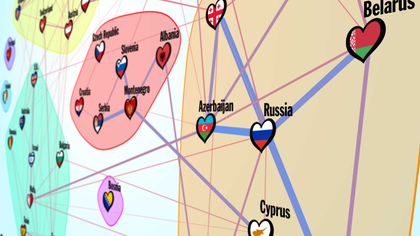
Connections Graph for 2017.
http://imgur.com/yIJJfuN
Connections Graph for 2014-2017
http://i.imgur.com/CbwbVzm.png
I don’t think any of the countries moved group. Portugal and Moldova are no longer islands.