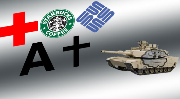
[Today, we step into the Think Tank, our steel cage match of ideas and friendly one-upsmanshp, to consider what is the best logo in the world. Read carefully all the entries and vote for your favorite at the end.]
Perich: The Red Cross
The Red Cross has the superior logo, out of everything in the world that does currently or could ever possibly use a logo, for the following reasons.

It Is What It Says It Is
Every other corporate or institutional logo hinges on some advanced symbology and semiotics to convey a particular meaning. The cursive in the Coca-Cola logo invokes nostalgia, classical traditions and an old-timey mystique. The multicolored serifs of the Google logo call up the playful simplicity of the peak of the dot-com boom.
These symbolic effects are powerful, certainly, but they take a certain amount of reaction time. The brain has to connect symbol to signifier to signified to referent. It can do this very quickly – but not instantly.
No such connection is needed with the Red Cross. The logo for the International Red Cross is a red cross. That’s what it is. There is no way you can mistake that for something else. You might think Coca-Cola is some guy’s signature, and that Google is a nonsense name made by five-year-olds, but nobody ever makes that mistake with the Red Cross. Because their logo is a cross that’s red.
It Appears Everywhere
Let’s say a friend invites you over to his house to play a few hours of some hot new first-person shooter video game on the XBox 360. You pick up the controls, fumble your way through a brief tutorial, then start shooting some bad guys. All of a sudden – whoa! Giant alien blasts through the wall next to you! The screen starts flashing, the controller starts vibrating. You’re in trouble!
What do you do? Ask your friend for help? Of course not. You’re a male between the ages of 18 and 45 (I said you were going to a friend’s house to play an FPS, right?) – you don’t ask other human beings for help!
Besides, you don’t need help. Even though this video game is completely new to you and it could be set anywhere—a German prison during the second World War, a Martian research laboratory, an urban fortress surrounded by zombies—you know exactly what you need: a health pack.
And you know exactly what it looks like:

The logo for the International Red Cross has become the universally acknowledged symbol for “healing goodies.” People who couldn’t tell you when the next blood drive is or how to perform CPR know that the White Box with the Red Cross on it contains the Stuff That Keeps You From Dying So Much.
That’s market penetration, people. Pepsi would kill for that Q score.
It’s The F#$%ing Red Cross, People
I don’t know if “importance of the organization being represented” is a valid metric for Best Logo. But if it is, I’d like you to consider the following:
Which is most important?
(A) Being able to quickly and accurately identify a source of Coca-Cola when craving a caramelized, caffeinated beverage?
(B) Being able to quickly and accurately identify an Apple product when looking to organize documents, play back digital media, or examine hypertext via networked computers?; or
(C) Being able to quickly and accurately identify the Red Cross tent when carrying your six-year-old child, his veins a fiery red from the blood infection he got while stumbling through knee-high sewage runoff after the levees north of your thirty-thousand dollar home broke, leaving you at the mercy of looting mobs and corrupt cops?

Good branding saves lives.
Good symbols should not be bastardizable (that a word?). The Christian cross is to simple. It has been tweaked, perverted, adorned or otherwise adapted to the subdivision of Christianity.
The Red Cross gets major points for universality and it will likely win because it is most recognizable versus best all around.
American Apparell is just ripping off the Gap from the 80’s(? – egads was it that long ago). Sun has a good logo, just like Nabisco and Nike, but it’s just good.
Which leaves Starbucks. The damn thing is so unique, ubiquitious, and uniformly represented that it beats the Red Cross. Sure, we associate the Red Cross with video game powerups. Did you know that they are in charge of getting messages to military members on the front lines? Did you know that they shot into fame by helping out at the Jamestown flood, by bringing both supplies and a PR crew. They do blood drives, they do so many things that people don’t think about instantly.
Green Mermaid lady -> instantly we think ofcoffee, wifi, music, done.
I wish I knew you folks were actually writing up the worst logo, because I would have chimed in. The worst logo is clearly the universal radiation warning sign. It is, in fact, so ineffective a logo (from certain angles it looks like an angel), that the U.S. Department of Energy and the EPA spent years trying to replace it with something that better signified, “Stay away from this shit! It will melt your eyes!”
Check it: http://www.damninteresting.com/?p=160
I’ve been a big fan of the Sun logo for years, for precisely the reasons mentioned. The argument for the Red Cross was compelling, though.
@Wrather: I know Starbuck is from Moby Dick, but I didn’t remember that he had a coffee fixation. Incidentally, the Starbucks people were originally planning on calling their store either Pequod or Moby’s Coffee, depending on which account you read. I do like the fact that, thanks to the ubiquity of Starbucks coffee, all three mates in Moby Dick are now named after chemical dependencies (the other two being Stubb (i.e. of a cigar) and Flask (i.e. of hooch.)
@Mlawski: You’re totally right. Now, the international biohazard symbol, on the other hand – you know, the one they put on medical waste and the like – that one looks like it would slice you up reeaal good, just for making eye contact.
What about the Jesus Fish, then?
I would have voted for SBux, but apparently I missed the deadline. Where are the results?
My vote goes for Christianity’s Cross. The Red Cross was close, though, The Jesus Fish is a symbol, and thus lacks the power that puts the crucifixion’s cross at the top.
Sun Microsystems strange shapes actually looks like S’s, but are also obviously U’s and N’s. Holy Crap!