Sheely: American Apparel
This is the logo for the American Apparel clothing company:
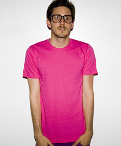
That’s right, I’m making the argument that American Apparel’s logo is not the name of the company Helvetica as it appears on store signs, advertisements, and the tags of countless plain, yet brightly-colored t-shirts, deep v-necks, underwear, and leggings, but is instead the plain, colorful clothes themselves. Am App’s use of plain garments is noteworthy because of the fact that most other clothing companies create and propagate their brand identity by placing their logo on each piece of clothing that they sell, and even organizations that don’t primarily sell clothes frequently put their logo on t-shirts in order to raise their public profile.
In contrast, American Apparel sells clothes to hipsters, that fuzzy set of young, affluent, image-conscious urbanites that by and large consider themselves too cool to wear clothing advertising a particular company. By catering to (and possibly creating) this demand for logo-less clothing, American Apparel has largely become synonymous with mainstream hipsterdom, so much so that it is possible to make the inference that any item of clothing being worn by a hipster is from American Apparel. As a result, the American Apparel logo is not just the garments themselves, it is also the people who buy and wear the company’s clothes. Patrons of American Apparel are themselves an advertisement for the company, even when they aren’t wearing a single item of the brand’s clothing, even though what they think they are doing is cultivating their own “personal brand”.
There are plenty of good reasons to disagree with the argument that American Apparel has the “Best Logo in the World” (beyond pointing out the fact that I’ve chosen a logo-less logo). American Apparel’s multitude of sexually suggestive soft-porn print ads and billboards (NSFW) showcase the normatively troubling implications of treating people as logos rather than individuals. Acolytes of the brand might respond by pointing out that all of AA’s garments are made sweatshop-free in the U.S. However, even if spreading fair labor practices were the company’s main objective (and it isn’t), this would still be a less noble fusion of purpose and representation than providing relief in the aftermath of man-made or natural disasters or saving souls.
However, if we instead evaluate logos by the standard of what they are supposed to do– act as the abstraction of a corporate entity– the calculus changes completely. American Apparel has convinced millions of young people around the world that by buying logo-less clothes they are shedding the chains of brand-centric consumer culture, when they are in fact actually turning themselves into walking (or passively splayed) billboards. By not having a logo at all, American Apparel has created the ultimate logo.
Good symbols should not be bastardizable (that a word?). The Christian cross is to simple. It has been tweaked, perverted, adorned or otherwise adapted to the subdivision of Christianity.
The Red Cross gets major points for universality and it will likely win because it is most recognizable versus best all around.
American Apparell is just ripping off the Gap from the 80’s(? – egads was it that long ago). Sun has a good logo, just like Nabisco and Nike, but it’s just good.
Which leaves Starbucks. The damn thing is so unique, ubiquitious, and uniformly represented that it beats the Red Cross. Sure, we associate the Red Cross with video game powerups. Did you know that they are in charge of getting messages to military members on the front lines? Did you know that they shot into fame by helping out at the Jamestown flood, by bringing both supplies and a PR crew. They do blood drives, they do so many things that people don’t think about instantly.
Green Mermaid lady -> instantly we think ofcoffee, wifi, music, done.
I wish I knew you folks were actually writing up the worst logo, because I would have chimed in. The worst logo is clearly the universal radiation warning sign. It is, in fact, so ineffective a logo (from certain angles it looks like an angel), that the U.S. Department of Energy and the EPA spent years trying to replace it with something that better signified, “Stay away from this shit! It will melt your eyes!”
Check it: http://www.damninteresting.com/?p=160
I’ve been a big fan of the Sun logo for years, for precisely the reasons mentioned. The argument for the Red Cross was compelling, though.
@Wrather: I know Starbuck is from Moby Dick, but I didn’t remember that he had a coffee fixation. Incidentally, the Starbucks people were originally planning on calling their store either Pequod or Moby’s Coffee, depending on which account you read. I do like the fact that, thanks to the ubiquity of Starbucks coffee, all three mates in Moby Dick are now named after chemical dependencies (the other two being Stubb (i.e. of a cigar) and Flask (i.e. of hooch.)
@Mlawski: You’re totally right. Now, the international biohazard symbol, on the other hand – you know, the one they put on medical waste and the like – that one looks like it would slice you up reeaal good, just for making eye contact.
What about the Jesus Fish, then?
I would have voted for SBux, but apparently I missed the deadline. Where are the results?
My vote goes for Christianity’s Cross. The Red Cross was close, though, The Jesus Fish is a symbol, and thus lacks the power that puts the crucifixion’s cross at the top.
Sun Microsystems strange shapes actually looks like S’s, but are also obviously U’s and N’s. Holy Crap!