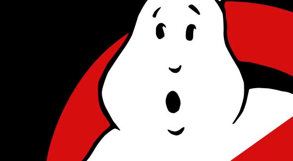
 Ghostbusters is one of those movies that makes moviemaking look easy. The jokes are funny, the scary parts are scary, the special effects hold up surprisingly well, and the pop single is timeless. But let’s not forget about the classic logo, which tells you everything you need to know. Ghosts are supposed to be terrifying, inexplicable, and powerful beyond measure. The logo promises that not only will they be defeated, they will be neutered and mocked. We’d all seen plenty of movies about people fighting ghosts (for example, Poltergeist was only two years before Ghostbusters). The genius of this movie is that although the ghosts are often portrayed as legitimately terrifying (think about the scene when the black hands burst out of the sofa to grab Sigourney Weaver), the main characters quixotically try to bring them down to the level of a cockroach or other household pest. The movie is all about taking something unbelievable and treating it like something mundane. That’s right there in the cartoony, cheeseball logo.
Consider the opening scene, set in the New York Public Library. If you saw that on its own, you would have no idea you were watching a comedy. The menace builds slowly as books float through the air when her back is turned. Finally, she sees the index cards. She flees just as they begin to flurry down, the drawers springing open inches behind her. The camera moves with her as she runs desperately through the stacks. She turns the corner, gets hit with a blinding light, screams in horror, and… cue the logo.
The scene isn’t funny at all. But by capping it with the logo and the jingle, the whole thing is reframed as a commercial. A moment of nail-biting suspense becomes a pitch: “Who ya gonna call?” That’s what the Ghostbusters do—they take horrifying situations and turn them into a profitable small business.
 Of course, this is not just the logo of the movie, it’s the logo of the business in the movie. It’s one of the few diagetic logos I can think of. (“Diagesis,” for those of you who didn’t take Intro to Film Studies, refers to something within the world of the movie. When John Cussack holds up a boombox in Say Anything, Peter Gabriel is diagetic.) The only other diagetic movie logo I can think of is Jurassic Park. The logo is slapped on all the trucks at Richard Attenborough’s dino resort. So both these logos are doing more than selling the movie; they are attempts by the characters to sell us something they probably shouldn’t be selling us. In other words, they’re both dangerous lies.
The ghosts in Ghostbusters are a world away from the Casperish cartoon we see in that red circle. They are scary things that can potentially destroy the world, and it’s not entirely clear whether our heroes can stop them. When they are summoned to the Sedgewick Hotel, the Ghostbusters try and act like this is a routine walk in the park. In fact, they nearly destroy the place and light a cleaning woman on fire. “Why worry?” says Ray. “Each one of us is carrying an unlicensed nuclear accelerator on his back.” The whole thing is insane, and they know it, and the cutesy logo is overcompensating. Similarly, the Jurassic Park logo presents the T-Rex as a skeleton, not as an animal with instincts and volition. It encourages us to think of the Park’s dinosaurs as exhibits in a fancy museum. But the actual dinosaurs are incredibly fast and powerful, and refuse to behave like exhibits. Those sharp teeth on the logo become horrible premonitions. So while in Ghostbusters, the boys eventually live up to the promise of their logo, in Jurassic Park it becomes a ironic mark of hubris.
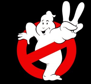 The Ghostbusters logo tells you about the movie and about the characters who supposedly created it. It’s an incredibly clever symbol. I’m sorry to say, however, that the Ghostbusters 2 logo is a complete mess. It’s no longer diagetic–instead, it’s a parody of the logo of a fictional business, which is a lot of abstraction for a comedy. And why is the ghost happy? Hasn’t he been busted? Then again, it looks like he’s breaking out of the circle, with one foot already on the ground. Is that the movie’s way of building the stakes–presenting us with a ghost who is fighting back against his own busting? In any case, this ghost still looks harmless, even friendly, so I can’t say I’m worried about whether the red circle can hold it. Honestly, I’m really not sure what we’re supposed to learn from this logo, besides that it’s the second Ghostbusters movie. At least that much is clear. From the two fingers.
If I were redesigning the Ghostbusters 2 logo, I’d keep the scared/surprised-looking ghost from the first movie with one of these variations:
- Put a second crossbar on the circle, sloping the other way, so there’s a big X over the ghost.
- Put two crossbars running straight up and down, like bars on a jail cell. The ghost can be clinging to them pitifully.
- Keep the same solo crossbar, but this time the ghost has two heads.
In all three of these cases, you lose the diagetic aspect of the logo (the logo the Ghostbusters actually use doesn’t change between movies). But you’d at least keep the messaging of the logo consistent, while tweaking it to give the second film its own visual identity. If they ever do Ghostbusters 3, hopefully they’ll wipe the smile right off that thing’s face. Busting makes me feel good. Not ghosts.
 UPDATE, 11:30 am: So as Erik points out in the comments, I made an error in the previous paragraph. The Ghostbuster 2 logo DOES appear diagetically, as a sort of triumphant “we’re back” logo. But this just confuses me more. The Ghostbusters are equating THEMSELVES with the ghost in the logo! You know what this reminds me of? All those bbq restaurants that have smiling pigs or cows out front. It’s always seemed weird and morbid to me. I mean, an exterminator would never have a friendly smiling rat on its truck. Maybe a malevolent, leering rat, but not a cutesy one.
The worst part is that they MADE it diagetic.
In GB2 they have that logo on their uniforms. (Was it on the firehouse? I can’t remember. Oh, Scout, idea for future story: the sign is still inside the firehouse in Tribeca.)
It’s so forced. Yeah, they were stressing “we’re back” (through both the end of the first “busting” scene and the Bobby Brown song), but would you really go through the bother and cost of putting a “sequel” logo in place?
That’s made no sense to me ever since I first saw it in 1989.
On a side note, given your love for Ghostbusters, were you, like me, mad at the first (Michael Keaton) Batman film because it decimated DB2 that summer and stole all of its Box Office mojo?
I updated the post to reflect this new info – thanks!
Back in 1989, I don’t think I was following the box office. But considering it today, I gotta say that Batman deserved to make more money. That was a great film. I like Ghostbusters 2 a lot, but it’s not Ghostbusters 1.
I agree regarding Batman, but I was 12 at the time so I forgive myself.
Wait…Batman counts as another diagetic logo, doesn’t it? Along with Superman and the Green Lantern?
This occurred to me this morning, actually. Superhero logos are diagetic symbols, but they’re very different than the business logos of Ghostbusters and Jurassic Park. Michael Chabon wrote a fantastic essay in the New Yorker about superhero costumes and their meanings. And what he points out, correctly, is that a superhero’s “disguise” actually reveals his deepest secrets:
We say “secret identity,” and adopt a series of cloaking strategies to preserve it, but what we are actually trying to conceal is a narrative: not who we are but the story of how we got that way—and, by implication, of all that we lacked, and all that we were not, before the spider bit us. Yet our costume conceals nothing, reveals everything: it is our secret skin, exposed and exposing us for all the world to see. Superheroism is a kind of transvestism; our superdrag serves at once to obscure the exterior self that no longer defines us while betraying, with half-unconscious panache, the truth of the story we carry in our hearts, the story of our transformation, of our story’s recommencement, of our rebirth into the world of adventure, of story itself.
http://www.newyorker.com/reporting/2008/03/10/080310fa_fact_chabon?currentPage=all
So just as the Ghostbusters logo embodies the conflict of the movie (trying to treat the terrifying as merely annoying), the Superman or Batman logos contain the whole plot in coded form. Bruce Wayne is scared of bats. So he forges a bat-shaped throwing star out of steel:
http://designrfix.com/wp-content/uploads/2010/08/photoshop-tutorials-2010-july-23.jpg
It tells the story of his childhood, his ninja training, and his gritty rebirth.
The “II” sign DOES appear in a back corner of the firehouse in the 2009 game, along with a door from ECTO-1A. It’s just unceremoniously stuck behind some miscellaneous junk.
I’m more upset that Batman squashed the box office of UHF, the best movie of that summer.
And a movie begging to be overthought.
yes. yes it is.
I love this article and everything it represents. But, just to be a bit nit-picky, it’s Peter who says the “unlicensed nuclear accelerator” line.
I’d never put that much thought into the logo myself beyond “Ooh, it looks cool” as I’ve never studied any kind of art design or things like that. Being a huge fan, though, it’s nice to have an even deeper hook into the story and setting like that.
You’re totally right. It’s a very Venkman thing to say, isn’t it?
of course bbq joints have smiling pigs and cows on their logos–we’re supposed to want to eat them! an exterminator will have creepy looking critters on his logo because we’re supposed to fear them (the critters) and want them dead.
we want to think of the pig who is providing us with sustenance as being happy to do so (at least the bbq joints want us to see it this way). this way people won’t think the bbq joints are being cruel in serving up charred animal carcasses (well, to everyone but peta, that is).
It would be a bit disturbing if a Barbeque place had a logo of a very obviously terrified cartoon pig. They don’t want to make you feel guilty.
Honestly, I think most people don’t look at a living cow or pig and immediately start salivating. There’s a disconnect between the animal and the food, and that’s how most people like it. For instance, I don’t see the veal people reminding us about all those baby cows.
So you’re saying that the Ghostbusters 2 logo is something weird, and it don’t look good?
If only there was someone you could call…
The Wayland-Yutani logo is stencilled on things throughout the Alien franchise. A particular favourite of mine as its never really pointed out. Also (and I could be wrong) dont we see the OCP logo repeatedly in Robocop?
Just checked and you do. Concentric circles stylised as an OCP. No more comments from me tonight though, watching the rest of robocop.
true, but neither of those logos are the movies’ logos
Gah! I’m going to be trying to remember diagetic logos all night now. How about the branding (and re-branding) of the fried chicken franchise in Ghost World? Or Duff Beer in The Simpsons? Of which their are now IRL versions (albeit unliscenced ones).
The GB2 logo is a bit flawed, but like you point out there are a lot of counter-intuitive and just downright bad logos in the real world. I think fictional brands just have to be better, more considered and loaded up with tropes because in fiction you can’t get away with ambiguity or implausibility. Although impossibility is just fine – I’ll accept that Zuul or Stay-puft exists but a confusing, shoddy fictional brand? That’d be too jarring in a movie.
It’s interesting how lots of fictional brands become well known and end up getting launched as real ones. Off the top of my head: I’m sure I read that Southpark Cheezy Poofs were being made, and there’s the duff beers. And 7-11 temporarilly redesigning some stores to look like Kwik-E-Marts to tie in with the Simpsons movie.
When talkin about how the GB2 logo makes it plain to see that the two fingers indicates the sequel, you say: “At least that much is clear. From the two fingers.”. But i showed my girlfriend and she had a good point that it looks like the ghost is making a peace sign, leading to a wide and confusing range of interpretations. I agree the logo sucks. Good article!
Here are the cars for some exterminators in my town:
http://www.trulynolen.com/corporate/mouse-car.asp
There are actually a few StaPuft products available for purchase nowadays, but I always confused the Michilan Tire guy with the StayPuft Marshmallow Man as a kid (and even when I’m not paying close attention now). So there’s a successful brand or symbol from the same movie, at least for me.
Dunder Mifflin also has paper products out there, and you can get Darwin Initiative stuff, too. Which makes me wonder…
Was the Ghostbusters logo/song the first viral ad campaign, then?
@Gab
You’re not alone in confusing the two. The Francophone translation actually calls him “Le Bibendum Chamallow.”
Maybe the Ghostbusters 2 logo is representative of Slimer, who’s generally friendly and helpful.
And the Ghostbusters do start out the movie having to perform at children’s birthday parties. The new happy ghost logo is kid-friendlier.
It’s worth noting that the earliest design concepts for the GB2 logo had the ghost OUTSIDE of the “No” sign. Stephen Dane’s design sketches for ECTO-1A, as seen in “The Visual History” and the “Ectomobile Owner’s Manual,” featured this with the note “ADD NEW GB LOGO.”
I can only assume someone decided that it wasn’t aesthetically pleasing, and back into the “No” sign he went.