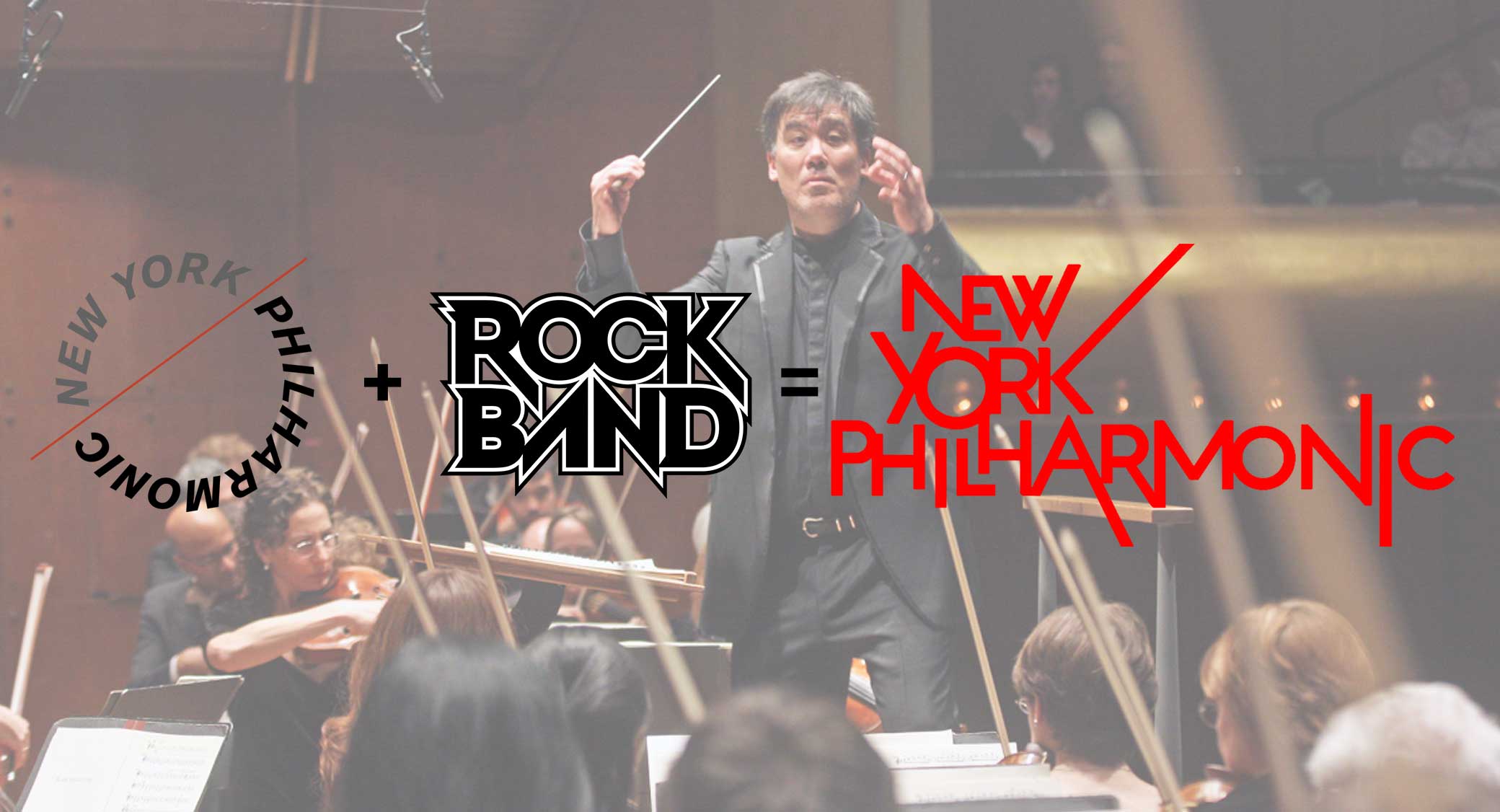
The New York Philharmonic (or “the Phil” for short) is the oldest symphony orchestra in the United States, so when it makes any sort of major change, it’s a big deal. In February 2016–just a few days after naming a new music director–the Phil unveiled a new logo. Here’s the old look:
![]()
And here’s the new:
![]()
The design blog Brand New was not kind to the new look, declaring it a “solid entry for Worst of the Year in 2016.”
Ouch.
This, as far as I can tell, is the only analysis of this logo on the internet. Which is a shame, because there is a lot going on here.
Specifically, we need to talk about why a symphony orchestra seems to be evoking the Rock Band video game logo, and by extension, the logos of a number of heavy metal bands:

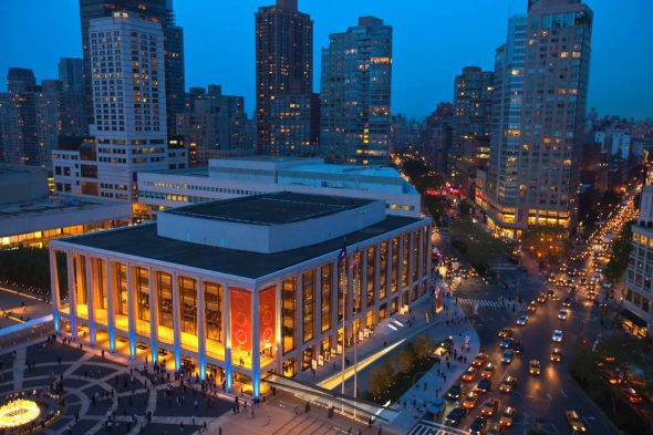
But first, we need to tackle how the new logo reflects the urban planning conundrum of the Phil’s home, Lincoln Center.
Symphony in the City
The most striking difference between these two logos is the sense of connection, in particular with the words “New York.” Let’s start with the new logo. Notice how in each of the three words, all of the letters are connected to each other and how “Philharmonic” touches upon the “York” in “New York.”
![]()
Now, take a look at the old logo again. There’s no connectivity within the words, much less between them. In fact, “New York” is separated from “Philharmonic” by a bright red line.
![]()
This idea of connecting with the city is hugely important to any orchestra that hopes to both tap into the city as an audience and act as a semi-official representative of the city’s cultural capital. But it takes on extra significance when considering the physical layout of the Phil’s home, Lincoln Center.
If you’ve ever visited New York, chances are high that you walked up Broadway and enjoyed the impressive view of Lincoln Center, looking west upon the fountain and its three main performance halls.
All fine and good, but look at the subtle details that set Lincoln Center (and by extension, the Phil) apart from the street and the rest of the City on the Broadway side. There’s a small staircase that elevates the plaza from the street level. If you use street view to browse around the corner, there’s also a parking driveway for cars (albeit one that’s tastefully tucked underground).
All fine and good, but now take a look at Lincoln Center from Amsterdam Avenue. Facing north, Lincoln Center is…that ugly wall on the right:
Here, there are no clear invitations to enter into the space. The divisions aren’t subtle cues that signify an elevated cultural space; instead, they’re straight up barriers to any sort of engagement, in particular for the lower-income, racial and ethnic minority residents of the public housing projects to the west. Lincoln Center essentially has its back turned towards the City.
(This is not a new observation; people have been criticizing these aspects of Lincoln Center pretty much since it was built. If you want to learn more about this — and if you’re an Overthinker, trust me, you do — get your hands on a copy of The Power Broker and read it cover to cover.)
In this context, the old Philharmonic logo feels like Amsterdam Avenue: on one side lies New York City, on the other side lies the Phil. Not necessarily the image you want to project for an orchestra that faces constant pressure to maintain its relevance with modern audiences. (To be fair to the Phil, the orchestra does get outside of the confines of Lincoln Center frequently — most notably with its free summer concert series in parks in all five boroughs — but for the purposes of this discussion, we’re focusing on what the logo communicates.)
The new logo, on the other hand, emphasizes connectivity across the board. Not just with the letters running into each other, but with the extending lines that reach out beyond its own confines. Note that the designers of the logo provide instructions for multiple variations of these extending lines:
![]()
Perhaps not coincidentally, the Phil will soon be moving out of Lincoln Center–temporarily–while its concert hall undergoes a multi-year renovation. During this time, the Phil will venture out into the city, playing out of temporary venues. Think again about those lines extending out from the core. Appropriate, no?
Also, think about some of those temporary venues like Carnegie Hall. Not that Carnegie Hall is any sort of paragon of egalitarian access, but look how the space itself sits at street level, without much of anything separating the public from the front doors:
I’m not necessarily saying that this particular aspect of the logo–the extending lines–look good. I’m saying that they convey a very different sense of connectivity compared with the old logo, especially in the context of the Philharmonic’s physical relationship with New York City.
Metal and Mendelssohn
My pet urban planning theories aside, the most important charge for the logo is presumably to help the Phil and its music connect with audiences; i.e., put butts in the seats (be they at Lincoln Center or elsewhere). We’ll get to how the Phil is (or isn’t) doing that with its creative choices in a moment, but as for the logo itself, as I mentioned before, it seems to be clearly evoking the Rock Band video game franchise, which in turn is channeling the logos of various heavy metal bands.
As a reminder, here’s the Rock Band logo again:
Next, the logos for other heavy metal bands that also have lines protruding from the core:
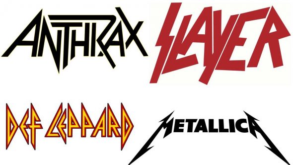
The thematic goal of these logos is to make these musical acts seem threatening and edgy. Compare a night stick with a medieval mace. Both objects are oriented around a common task–hitting things with blunt force–but adding spikes makes the mace look way scarier.

I don’t think the Phil is trying to look scary, or convey that it’s super effective at maiming its enemies, but it is trying to come off as something other than completely benign, or at least commonplace. But at the same time, it’s also trying to mix this sense of edginess with a sense of accessibility, just like the Rock Band video games. In case you don’t remember the rhythm game fad, games like Rock Band and Guitar Hero took inaccessible aspects of music–aggressive heavy metal and virtuosic guitar playing–and made them as accessible as possible to a lay audience. Granted, people playing these games were likely attracted to the guitar-driven rock that dominated these games, but most players weren’t actual musicians themselves, and they appreciated this new way to interact with music. Oh, and they also played the game with friends.
So the protruding lines in the Rock Band logo do double duty: they look aggressive while at the same time they suggestion connections between the audience and the music and among friends who are playing the game with you.
A lot of this bears out in the recent artistic choices of the Phil itself. Conductor Alan Gilbert hasn’t been shy about featuring contemporary classical music in the concert repertoire, even though many audience members (myself include) find this music alienating and confounding. Its “Art of the Score” series, which sets movies to the orchestra’s live soundtrack accompaniment, is both assertive in its artistic direction (i.e., away from the old symphony staples) and appealing to a mass audience that might not be interested in listening to Tchaikovsky, to say nothing of Messiaen.
(As awesome as it would be, I don’t think the Phil has plans for audience members to join them on stage with plastic controller instruments. But I could easily imagine a virtual reality experience which would allow anyone to strap on a headset and experience a performance in 3D space and sound. How could would that be? Free idea, Phil. Your move.)
Mozart in the Jungle
All of these ideas of connectivity and heavy metal aggressiveness are fine and good, but they must be considered in the context of the Phil in early 2016, a time of major transitions for the Phil in nearly every regard. Aside from the aforementioned multi-year concert hall renovation, the conductor’s baton will pass from Alan Gilbert to Jaap van Zweden in 2017. A new board chair and concertmaster took over in 2015. The Phil faces flagging season ticket sales and other financial challenges.
Meanwhile, the classical music world continues its self-obsession with the perilous state of the art form. Orchestras that are far less prosperous than the Phil go bankrupt; arts education in schools keeps getting slashed. The Amazon show Mozart in the Jungle, which equal parts celebrates and lampoons New York’s classical music scene, offers the priceless quote that “classical music has been losing money for people for 500 years — it’s not a business.” Think pieces take turns declaring classical music dead, then alive and well.
The Phil chose this moment of uncertainty to unveil its new logo. And that brings me to this final observation on the logo: is is anything but at rest. While its diagonal lines jut out in search of connections, its vertical and horizontal components lack any strict alignment. You can’t take a ruler and neatly underline any sort of base. It’s not sitting down; it’s standing up, ready to go.
![]()
In this regard, the logo is a spot-on reflection of the Phil’s current state. Again, that’s not the same thing as saying that it looks good or is pleasing to the eye, to say nothing of its effectiveness at accomplishing the Phil’s many business goals. But at least it says something interesting.
Add a Comment