When the musical Rock of Ages makes its leap from Broadway to the big screen, it’ll be getting a new logo.
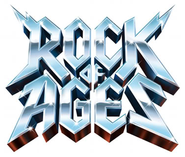
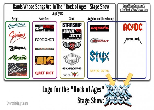
Here’s the logo for the stage show:
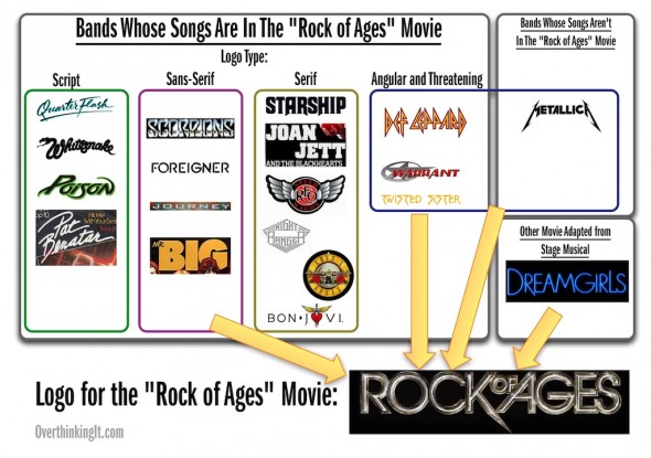
and here’s the logo for the movie:

Why this change? We’ll get to that in a moment, but first, let’s examine each of these logos on their own and decode their visual language.
Rock of Ages: The Stage Show
As you can see in the chart above, the stage show’s logo derives very little from the bands whose songs are in it. In fact, most of it comes from two bands who are only tangentially related in style to the music of the show: AC/DC and Metallica.
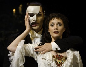
“Think of me, think of me fondly, when you FEEL THE NOIZE!”
This makes sense when you consider the context of the stage show: Broadway and cultural perceptions on musical theater. At the risk of stating the obvious, Broadway musicals occupy a very different cultural space than that of Quiet Riot, Whitesnake, and Twisted Sister. Consider this list of the top 5 longest running–and therefore most culturally salient–Broadway musicals of all time:
- Phantom of the Opera
- Cats
- Les Misérables
- Chicago
- A Chorus Line
Needless to say, none of those musicals feature face-melting guitar solos, head-banging, or references to sex with groupies in seedy Sunset Strip bars.
So when faced with the task of promoting an 80’s hair metal jukebox musical on Broadway amidst the likes of Wicked and The Lion King, the people behind Rock of Ages had to go out of their way to emphasize how f***ing metal this show is, or at least how much more f***ing metal this show is compared to Wicked and The Lion King. And what better way to do that than to borrow from heavy metal’s two most famous band logos?
Who cares if their music isn’t in the show, or not really that close to the style of music in the show? OK, metal purists/nerds might care. It is a little dishonest to suggest AC/DC and Metallica’s presence in a show that’s one or two notches lower on the Heavy Metal Dial, but let’s be honest: people who would actually get upset over this sort of thing aren’t in the target audience. “Metal” fans who appreciate some Poison silliness along with their AC/DC and Metallica are, however, in the target audience, and they will respond positively to the visual homage to those bands in the show’s logo.
Rock of Ages: The Movie
First, let’s identify the changes in bands from the stage show to the movie. Songs by Survivor, Quiet Riot, Europe, Styx, and Extreme are out; songs by Scorpions, Guns ‘n’ Roses, and Def Leppard are in.
Huh? What’s Dreamgirls, the movie based on the musical based on The Supremes, doing in this mix? And why did they lose the AC/DC and Metallica influences?
Again, context is key: Rock of Ages is no longer on the Great White Way. It now has to compete in a totally different cultural space, that of summer blockbusters at the multiplex. Whereas the Broadway show is self-selecting in its audience (people visiting or living in New York City or London and can afford a $50+ ticket), the movie is going after a much larger nationwide (and worldwide) audience at a far cheaper price point. The Broadway approach–emphasize heavy f***ing metal with a threatening, spiky logo–gives way to the multiplex approach: make this movie as easily accessible as possible. Make a subtle reference to Dreamgirls, a successful stage-to-screen adaptation. Round off the hard edges.
This aversion to hard edges is actually something of a rule for movie logos/poster design. Take a look at this compilation of movie posters for the remaining 20 June releases:
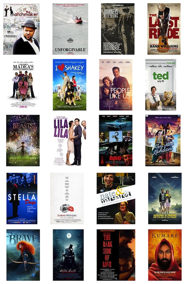
It seems that Hollywood’s marketing machine is powerful enough to smooth the hard edges off of even the roughest of surfaces: heavy metal music.
Admittedly, this is a pretty mundane explanation. But perhaps there’s an even more mundane one: readability. Both the Rock of Ages and Dreamgirls movie logos expand horizontally on their stage logos. Here’s the original Dreamgirls stage logo:

And this is what it became for the movie:

This gives the letters more room to breathe and reduces the slightly cluttered feeling of the original. Now take a look at the Rock of Ages logo transition again in this light:
It’s actually very cluttered. This…

Much less so. So it’s not a Hollywood conspiracy against jagged edges, AC/DC, or Metallica. It’s just…sensible graphic design that will help maximize visibility of the name of the movie.
Readers: what do you think? Am I underthinking it by just saying that the movie got better graphic designers? Is there some hidden psychosexual meaning behind the decidedly less phallic movie logo? Does the logo have a hidden pro-Romney agenda? Sound off Rock out in the comments!
Interesting piece. The first image that came to my mind upon seeing the new Rock Of Ages logo was Rockband, the multi-platform video game that makes slightly niche music relatable and accecable for a large audience.
THANK YOU. I knew it looked similar to something else and couldn’t recall what it was. Speaking of which, though, “Rock Band” and “Guitar Hero” have both declined precipitously in popularity since their heyday a few years ago, right?
Yes. Fad is over.
I miss the days of Rock Band / Guitar Hero
For nostalgia’s sake, I went to the downloadable songs section of both games. I noticed that the last song update for any game in the Guitar Hero series was April 2011, while Rock Band 3 continues to pump out downloadables. Is it merely a difference in focus between Activision and Harmonix, or has Harmonix stuck better than Activision in terms of playability?
I could write for days about this, but here’s the short version:
Guitar Hero I and II were made by a band named Harmonix, who is a company with a long history of music games originating from the founder’s passion for sharing music. They sold the Guitar Hero name to a company called Activision, and took the money they made with that sale to create Rock Band, which they’d stated was the game they always wanted to make in the first place.
Activision cranked out yearly Guitar Hero releases that were progressively less impressive, while Harmonix busted their asses and made the steallar Rock Band 3, which they support to this day despite it’s underwhelming sales.
One sentence explanation: the Guitar Hero franchise is managed by a company who is trying to bank on someone else’s established brand, while the Rock Band franchise is using the capital they’ve built through years of dedication to accomplish it’s long-term goal of maintaining a good game well.
It’s tragic. Just for readability, they’re sacrificing the double-axe potential of the Broadway version of the logo. Spaces in between each of the words leave a vertical line into which a nice axe-handle could be inserted. The Hollywood logo might be good for a can-opener, but that’s about all.
Rock of Ages: The Stage Show is deliberately not your maiden aunt’s Broadway show. The stage show marketed itself to a very sharply differentiated but demographically rich group: 40-something MILFy former groupies. When I saw the show on Broadway the group in the row ahead of me were six women meeting that description who had pre-loaded heavily.
Rock of Ages also bucked standard musical theater custom in another way, drinks were allowed, nay, encouraged to be taken to your seats. Now I have been to other shows, most notably Cabaret and Bloody Bloody Andrew Jackson where alcoholic drinks were allowed at your seat, but RoA went one step further by having beer girls hawking in the aisles during the intermission, which I found a cute variation on the London theater tradition of selling ice cream between acts. This further enhanced the chance that the already drunken women in the audience would only get more hammered by the final number. I posit that a pick-up artist could do well by just standing at the exit door and follow tipsy middle-aged women to their post-show watering hole.
Another interesting choice in the marketing is the emphasis on Stacey Jax, the Tom Cruise character, instead of the romantic couple who are the ostensible leads of the show. I understand star power, but Jax is not the focus of the musical and is really little more than a boy-loses-girl-to-heavy-metal-star plot device.
The casting is also interesting in that fully half the cast, Cruise, Baldwin, Zeta-Jones, are all well into their 40s and would be more appropriately cast if they were the age they were in 1987 when the show is set. I want to see if this movie can successfully market to all four corners.
Saw the movie last night. I’ll talk more about it on the podcast, but some quick observations on fonts and logo in the movie: basically, they entirely ditch the simple sans-serif logo we see in the posters and marketing materials. The New “Rock of Ages” logo that we see in the opening sequence is about on par with the stage show logo in terms of aggressiveness and spikiness, though with more curves than the AC/DC-inspired design.
The titles in the opening credits–i.e., the names of the actors in the movie–are written in a font that I can only describe as Spinal Tap-esque.
So in other words, the simple, sans-serif logo was just for broader marketing efforts. Within the movie itself, the metal-ness of the logo and typeface gets cranked up to 11.
As for the movie itself, it’s OK. Better than the 43% rating it currently has on Rotten Tomatoes, but not as funny/raucous as it could have been. If the music and the cast appeal to you, and if you can keep your expectations low, then go see it. Also, it wouldn’t hurt to pregame.
I thought the movie was great, but was a little confused that no AC/DC, Metallica, Great White, Van Haylen etc… But, this kinda plays into the logo discussion of marginalizing something to make it appeal to the masses. Again, thought the movie was great, but everyone has a loathing stick to shake whenever Tom Cruise is mention and he was really good. Most of the people talking about the movie hate it and have never seen it, what happened America