


[The following is a guest post from data scientist and Eurovision super fan Sean Nixon. – Ed]
Every year, the constituent countries of the European Broadcasting Union (EBU) send their finest bands, divas, baking grandmas, and yodelers, to compete in the Eurovision Song Contest. Two Semi-Finals cull more than forty competing acts down to 26 who will perform at the Grand Final: ten countries from each of the two semi’s, the Big Five (France, Germany, Italy, Spain, and the United Kingdom) plus the hosting country. Beginning in 1975, the voting structure for the ESC was finalized to a ballot awarding 1–8, 10 and 12 points with each competing country (including those that only competed in the semi-finals) submitting a ballot (no voting for yourself). It has since become a hobby amongst european academics to dig through the eurovision voting records for network structures, economic correlations, or voting cartels. Last year, Overthinking It joined in on the data analysis fun, and from those humble first attempts has come the Eurovision Voting Examiner (EVE). You can try out EVE here.
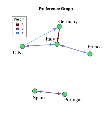


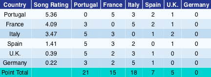
Table 1
To simulate a contest and generate voting data, the song for each country is randomly assigned a rating. For each county, the weights from the Preference Graph are added to the song ratings and a ballot awarding 1, 2, 3 and 5 points is generated based on these modified ratings. (Technical Note: Ratings are chosen from a normal distribution with standard deviation 2 so the weights in the Preference graph range from 0.5–1.5 standard deviations.) For the simulation shown in Table 1, this means that Italy manages to secure a second place finish over the higher rated song from France. Specifically, Germany has a preference for Italy with weight 2. When this is added to Italy’s 3.47 song rating we get 5.47, which is enough to earn Italy 5 points from Germany.
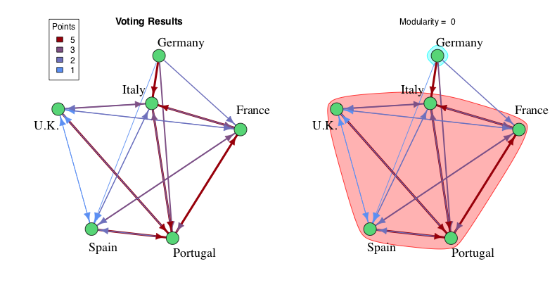

All the votes can be interpreted as the edges in a new graph connecting the original country nodes, i.e., Portugal giving France 5 points becomes an edge from Portugal to France with weight of 5. We can try to reconstruct the original communities from the Preference Graph by grouping the countries in a way that maximizes the Modularity. In layman’s terms, modularity measures how well the edges of a graph manage to stay within the voting blocs. The more edges that connect two countries within the same bloc the better. A formal definition might look like:
Modularity = |
Actual # of Edges within the Blocs – Expected # of Edges within the BlocsTotal # of Edges |
This means that you need to beat expectations to have a positive modularity. For example, putting all the countries into a single bloc yields a modularity of zero, since you already expect expect all the edges to stay within that one Mega-Bloc. A negative modularity means that you’ve done a terrible job of picking the voting blocs.
Trying to find the original voting blocs directly from the graph of voting results produces the correct answer in about one third of the simulations. The rest of the time, song quality skews the results, creating spurious connections in the direction of contest winners and missing connections to the weak entries. In the example from Table 1, the high rating (quality) of Portugal’s song, along with Germany’s abysmal rating, result in Germany being left out in the cold while the U.K., Italy, and France fall into the orbit of Portugal.
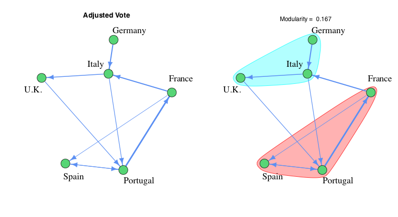
In an effort to remove the confounding effects of song quality, we introduce a new Adjusted Vote, which is equal to number of points awarded from a particular country minus the average number of points awarded across all countries. The edges of the Adjusted Vote graph represent all the places where a greater than average number of points were awarded. In this case, maximizing the modularity recovers the original voting blocs about two thirds of the time, doubling the success rate of just using the raw voting results. The example contest from Table 1, which you might have noticed was picked specifically for being difficult to analyze, shows a noticeable improvement after changing over to the Adjusted Vote. (Quite literally for the modularity value, which increases from 0 to 1.167.) The biggest error is the edge between Portugal and France that occurs because the U.K. and Germany snubbed France’s higher rated song in favor of Italy. Like when the sergeant asks for a volunteer and everyone but Bugs Bunny takes a step back. This is as far as the math will take us for a single competition. The final step is to take data from a series of simulations to smooth out the outliers of any particular contest.
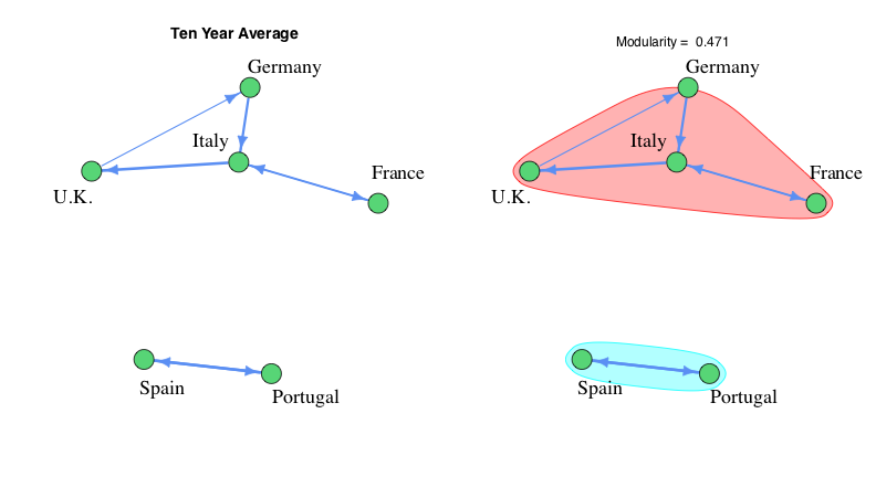
In the Ten Year Average graph, we simply take an average of the Adjusted Vote across ten simulated contests. The edges in this graph represent the top quartile of all the averages, which amounts to 7 out of the 30 possible edges. This ensures any negative or extremely tenuous connects are ignored. At this point, the method is robust to enough to see nearly 100% success in reconstructing the Voting Blocs from simulated contest data.
For the calculations that EVE performs we only take the top 10% of the averages. For the much larger data set that EVE works with, this is the sweet spot between keeping as much as possible while also limiting the computational requirements, allowing new graphs to be rendered in real time. The exact cut off does not cause a meaningful change in the resulting Voting Blocs, and at most sees the shifting around of free agents that don’t belong anywhere.
E.V.E. Highlights
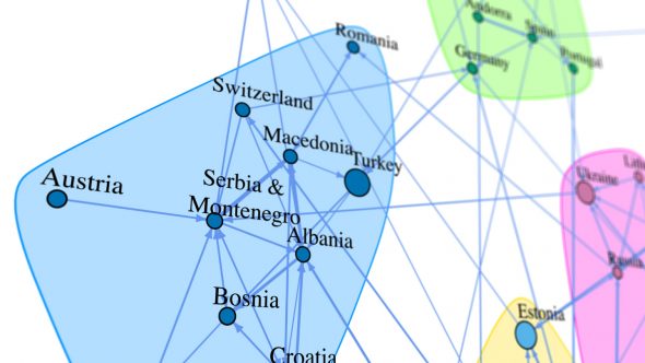
- After the breakup of Yugoslavia in 1993, it takes about ten years for a new voting bloc to form out of the six constituent republics (Bosnia, Croatia, Macedonia, Montenegro, Serbia, and Slovenia).
- In the Nordic voting bloc (Denmark, Finland, Iceland, Norway, and Sweden), Finland is the most likely to break rank.
- The biggest Eurovision BFFs are Romania and Moldova (Greece and Cyprus are number two). This makes a lot of sense, since modern Romania was formed from the merging of Wallachia and Moldovia in 1859. While the Soviet annexation of Moldova broke up that old alliance, the countries still share a common language, traditions, and taste in Euro-pop.
- Strained relations between the Ukraine and Russia in recent years have resulted in a steady downward trend in their previously strong Eurovision pairing. However, their mutual ties in the region ensure that they remain in the same voting bloc.
- The biggest discrepancy between points awarded vs points received exists between Turkey and Armenia.