The Case of the Week Quotient Returns!
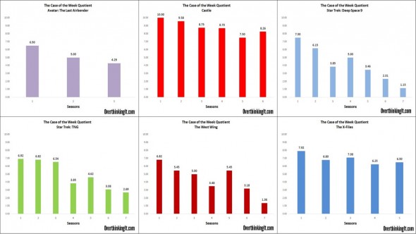
How does a TV series change over time? And can we measure it?
7 · Read More »
How does a TV series change over time? And can we measure it?
7 · Read More »

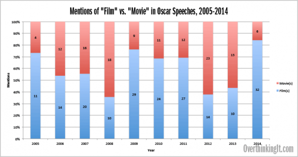
Adding statistical and linguistic fuel to the “Oscars are out of touch” fire.
0 · Read More »

Ford vs. Chevy, Men vs. Women, Obama vs. Country Music Fans.
3 · Read More »

Just how often do country songs reference trucks, and why?
9 · Read More »

A revised look at the statistics of superhero movies and if there’s any indication that they’ve hit their peak.
3 · Read More »
Is it useful or constructive to have a shorthand way of distinguishing between popular cinema versus arthouse cinema?

Changes in male and female income in romantic comedies over time… with a graph!

Does the density of a movie adaptation of a book have any effect on its quality? Is there an ideal length of a movie based on the book’s word count?

We crunched the numbers on novel length vs. movie length to see who’s guilty of “Hobbiting” a single book into multiple movies.

As public trust in the US government declines, it’s depicted less favorably in Hollywood.